Paynter -
|
|
Project Objective:
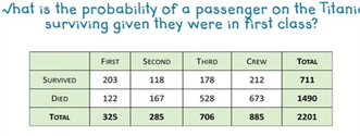
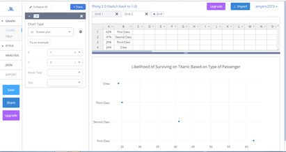
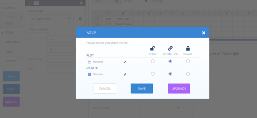
You will create a chart using Plotly to illustrate the probability of something you research actually happening. For example: I researched the probability of of someone surviving on the Titanic depending on what type of passenger he or she was. How to use PLOTLY 1. Create your own account in Plotly and login. 2. Click "New" 3. "Chart." 4. Under Chart Type, choose one under Basic 5. Title your Chart 6. Enter info for your X and Y Grids. Be sure to label on the chart itself. On the left make sure X and Y match A and B columns on the left or the graph won't look right. 7. Save and make a "private link." 8. Share the link with Ms. Paynter via email. ([email protected]) |
|
